
500 projects, one question: What does a CARE dollar actually buy?

By Gregory Parent October 6, 2026

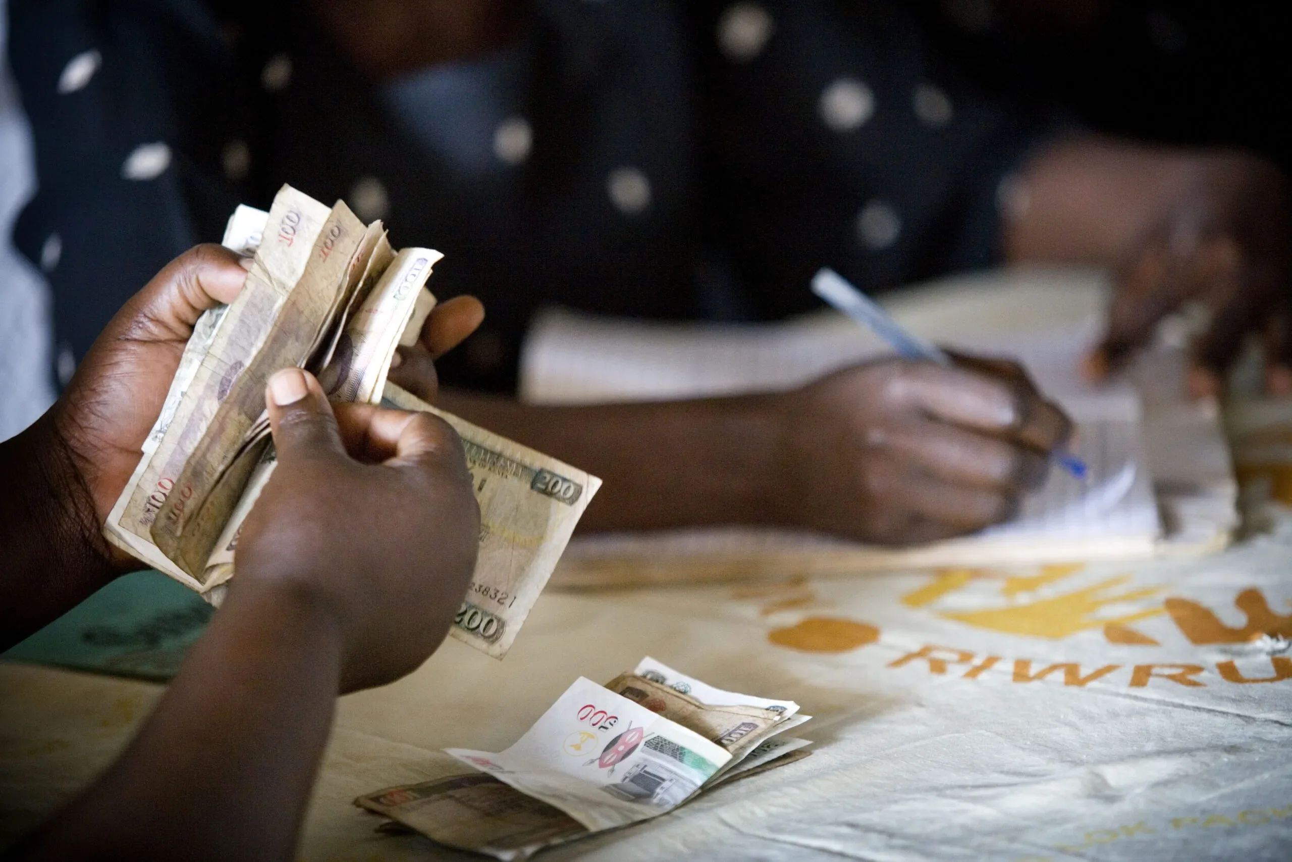
hands counting money

Gregory Parent, director of CARE's Economic Evaluation Unit, explains how CARE is instrumenting a 121-country portfolio to answer the first question serious donors ask.

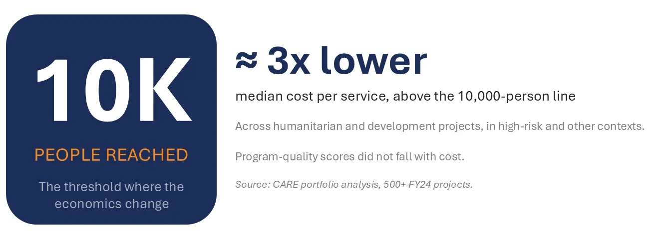
Infographic highlighting 10,000 people reached as a threshold where project economics change. It reports approximately 3× lower median cost per service above this threshold, with supporting notes on humanitarian and development projects.
All charts: CARE portfolio analysis, 500+ FY24 projects/Greg Parent.

Ask CARE what a dollar of its work buys, and until recently the answer has been coming from single- project cost studies, one at a time. That is not new for us. CARE is a founding member of the Dioptra Consortium, and we have been generating cost-per-output and per-outcome evidence for as long as the sector has been asking for it. What is new is what we are now asking of that evidence.

The sector’s question is shifting. Two decades of focused research produced a real answer to “does this work per dollar?” Now, as aid budgets shrink faster than needs, the pressure has sharpened. Programs must be efficient, effective, AND affordable. Affordability is the test every scaling pathway runs through, because someone must carry the cost once philanthropy exits: whether a government ministry or a market, who can afford to keep doing this? That shift is pulling three moves through the way we work:

  • From cost-effective to affordable, as the frame for whether an intervention has a future;
  • From backward-looking cost studies to forward-designing, so a proposal gets pressure-tested before it is written rather than reconstructed at closeout;
  • From one study at a time to system-wide, benchmarked evidence across more than 500 CARE projects in 121 countries. So, we are laying different pipe.

Why we are doing this, and why now

Cost-effectiveness at CARE is not a donor accountability exercise. It is a design tool, and it answers a specific problem. Philanthropy can fund a program. Only two things can sustain one at scale: a government budget that absorbs it, or a market mechanism that carries it. When a proven model is cheap enough for a ministry to defend, or commercially viable enough for the private sector to adopt, that handover is what makes the impact outlive the grant. That transition is the thing CARE exists to unlock.

Every cost and cost-effectiveness figure we produce answers one question: will this deliver more long-term impact per dollar than the next best option, and is the cost-per-output or per-outcome low enough that whoever carries it after us, government or market, can afford to keep going?

500 projects, one signal

Our first round of analytics gave us the 10K Rule. Projects that reached more than 10,000 people delivered services at about one-quarter to one-third the cost per service than smaller projects, and program-quality scores did not drop with cost. This is not a mystery: fixed costs (setup, staffing, infrastructure) spread across more people. What is more surprising is that the same pattern held even in fragile and high-risk settings, so long as scale was designed in from the start.
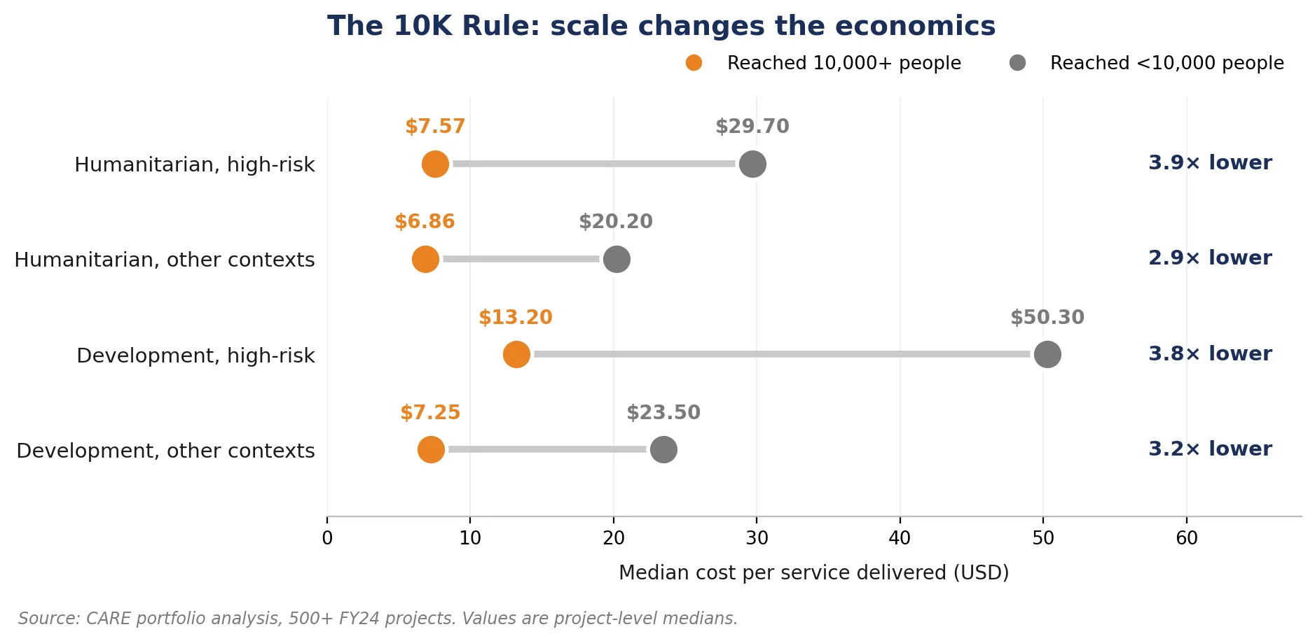
Horizontal dumbbell chart compares median cost per service delivered (USD) across humanitarian and development contexts by reach size, illustrating how scale changes economics. Orange markers represent projects reaching 10,000+ people and gray markers represent projects reaching fewer than 10,000, with lower costs at larger scale: $6.86–$13.20 versus $20.20–$50.30 and 2.9×–3.9× lower costs.
Median cost per service delivered, above and below the 10,000-person line, across four project types. Source: CARE portfolio analysis, 500+ FY24 projects.

Delivering cost effective results everywhere, especially the most fragile places

Much of the sector’s cost evidence sits in comparatively easy places: cash-transfer studies clustered in a handful of countries where scaling is straightforward, livelihoods evidence concentrated in stable rural settings, digital solutions where most people are already online every day. Where those models are adapted to emergency and conflict contexts, the evidence thins fast.

CARE’s play is different. We take proven solutions and adapt them to the contexts where they have not yet been tested at scale: conflict-affected regions, remote rural areas, informal settlements where the last-mile cost of reaching one more person will sit above the sector median.

That is the choice, and cost-effectiveness discipline sharpens rather than complicates it. Our metric is not the lowest possible unit cost. It is the most impact per dollar in the contexts where CARE works. Many of those contexts sit outside the sector’s usual evidence base. That is what CARE adds to the cost-per-outcome conversation, and it is the argument sector funders can carry when a government counterpart asks why our number is higher than a study from a different context.

Evidence to action, not just theory

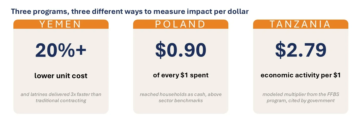
The finding is already changing our program design. Three programs across three contexts illustrate what different pieces of the economic question look like in practice.

Infographic compares three programs using different measures of impact per dollar across Yemen, Poland, and Tanzania. Cards report Yemen at 20%+ lower unit cost, Poland at $0.90 of every $1 spent, and Tanzania at $2.79 in economic activity per $1.
Three analyses, three different kinds of economic finding: program efficiency, unit cost, pass-through, and economic return.

Beyond unit costs, we have started to publish two other economic measures of what a CARE dollar sets in motion.

  • Benefits to participants themselves, our savings groups portfolio (VSLA and Youth VSLA) generates between $2 and $6.50 per $1 invested across the projects analyzed. That is money in members’ hands, and knowing the range changes the conversation at design stage, where program teams can make informed decisions about which cost drivers push towards either end of the spread, and which are necessary for the impact we deliver.
  • Benefits to the wider economy, a modeled analysis of our Farmer Field and Business School program in Tanzania estimated $2.79 in total economic activity set in motion per $1 CARE spent, a multiplier This is the kind of figure a Ministry of Finance uses to make a budget case, and the kind a funder can point to when arguing that a program will unlock co-financing at scale.

How the numbers changed the design

Numbers change decisions or they are wasted. CARE makes sure our data is driving our decisions. Here are three examples that show how we put data into action for better impact per dollar.

During delivery. In Yemen, our water, sanitation, and hygiene (WASH) team faced a choice between two delivery models for emergency latrine construction: contract the build to traditional providers or pay community members directly through a cash-for-work arrangement. The team ran the numbers on both options, and cash-for-work came out ahead on both cost and speed.The cash-for-work model cut unit cost by more than 20% and delivered latrines three times faster than traditional contracting. That is the model we ran, and the model the country team now reaches for first in similar humanitarian responses.

During design, before delivery even begins. We built an AI-powered assistant that helps proposal teams maximize value for money as they design a program. Sector benchmarking is one of several things it does. The goal is to run every proposal through this tool. At least 18 have been submitted so far, and likely more that have gone unreported. Where the tool is used, the proposal writer changes the design rather than defending a weak economic case. Program design shifts at many points in a program’s life: planning, implementation, closeout. The tool adds one more: giving teams a way to assess and adjust before the proposal is even submitted.

Confirming if we’re on the right track. Poland and Nigeria did not require a redesign. They confirmed the design in place was the right one. In Poland, our cash program for Ukrainian families delivered roughly 90 cents of every program dollar to households, above the ~88 cents pass-through that corresponds to the published floor of the Dioptra consortium’s benchmark portfolio of comparable programs. In Nigeria, local NGOs forming savings groups delivered comparable program efficiency to international NGOs when funded at comparable scale, evidence that localization holds up on the numbers when the money is there to make it work.

Making this routine, not artisanal

Numbers like these are only useful if we can produce them at the speed a program cycle moves.

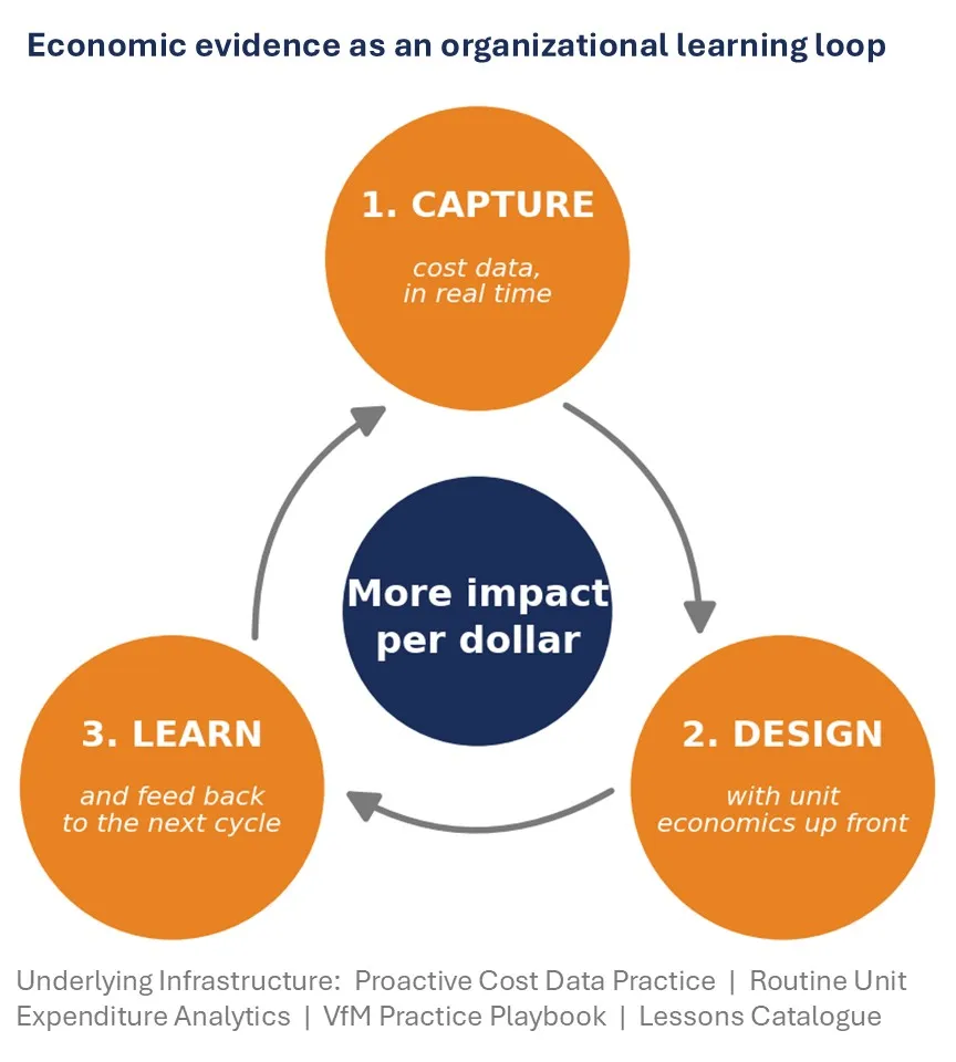
Circular process diagram titled “Economic evidence as an organizational learning loop,” showing how cost evidence supports greater impact per dollar. Orange stages—Capture real-time cost data, Design with cost assumptions upfront, and Learn through feedback—connect via arrows around a blue center, with supporting infrastructure listed below.
The three moves that together turn economic evidence into a continuous organizational learning loop.

The loop has three stages.

Capture. We are building end-to-end cost-per-output analytics. That is the pipeline linking our financial system to our impact-tracking system, plus the analytics on top that put current unit costs, benchmarked against the rest of the portfolio, in front of country teams. The Program Efficiency Enginelater this year, is what will run it. Once live, the lag between spending a dollar and knowing what that dollar bought drops from months to weeks.

Design. Cost discipline is moving to the front end of the program cycle. The AI-powered assistant described above helps proposal teams maximize value for money as they design a program, benchmarking against sector comparators as one function among several. It is in use across a growing share of country teams, and the ambition is that every new proposal runs through it.

Learn. What one project learns is available at the next project’s design table. The Value for Money (Practice Playbook and the Lessons Catalogue distill what our own cost studies have shown about which design choices drive cost-per-output and per-outcome, so a country team does not start from a blank page every time.

Our Economic Evaluation Unit, established in late 2025, works through Dioptra, IDinsight, and CEGA at UC Berkeley to make sure our figures are comparable across organizations and our methods stand up to external scrutiny.

What that discipline is worth

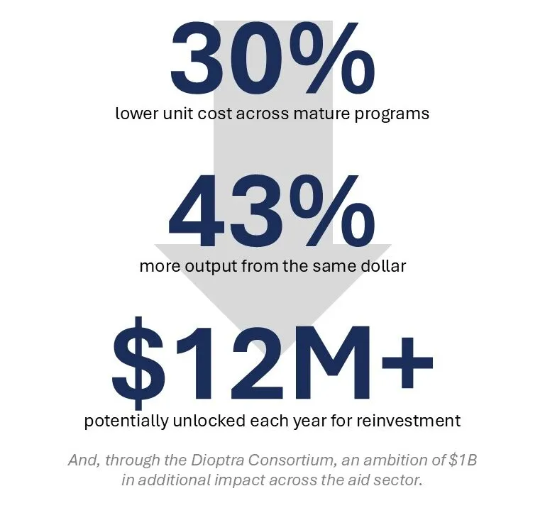
Infographic quantifies discipline value, highlighting 30% lower unit costs across mature programs and 43% more output from each dollar. Large navy figures emphasize $12M+ potentially unlocked annually for reinvestment, with small supporting text citing additional value through a disciplined approach.
What a portfolio-wide 30% cut in unit cost is actually worth, both to CARE and, through Dioptra, to the sector.

We are targeting a 30% reduction in the unit cost of delivering outputs across mature programs. A 30% cut means the same dollar delivers roughly 43% more output. Across CARE’s portfolio, that would unlock over $12 million a year to reinvest. Across the Dioptra consortium, our shared ambition is to unlock $1 billion in additional impact across the sector, reaching millions more people with more efficient aid.

The questions we’re committing to answer

Limited resources and rising needs mean that we all have to make smart investments about where money goes. Here’s what we want you to ask us when you’re thinking about partnering with CARE.

  • How much does it cost to deliver impact with this approach in this place?
  • How does that compare to sector benchmarks?
  • Can the whoever runs the program after us, government or market, afford to keep going?
  • Where are the numbers still weakest, and what are we doing about it?

Those are the questions that will keep making the next dollar buy more than the last one did.

Back to Top